FREYA NORDIC BAR
━━━━━━━━━━━━━━━━━━━━━━━━━━━━━━━━━━━━━━━
BRAND IDENTITY
THE PROJECT
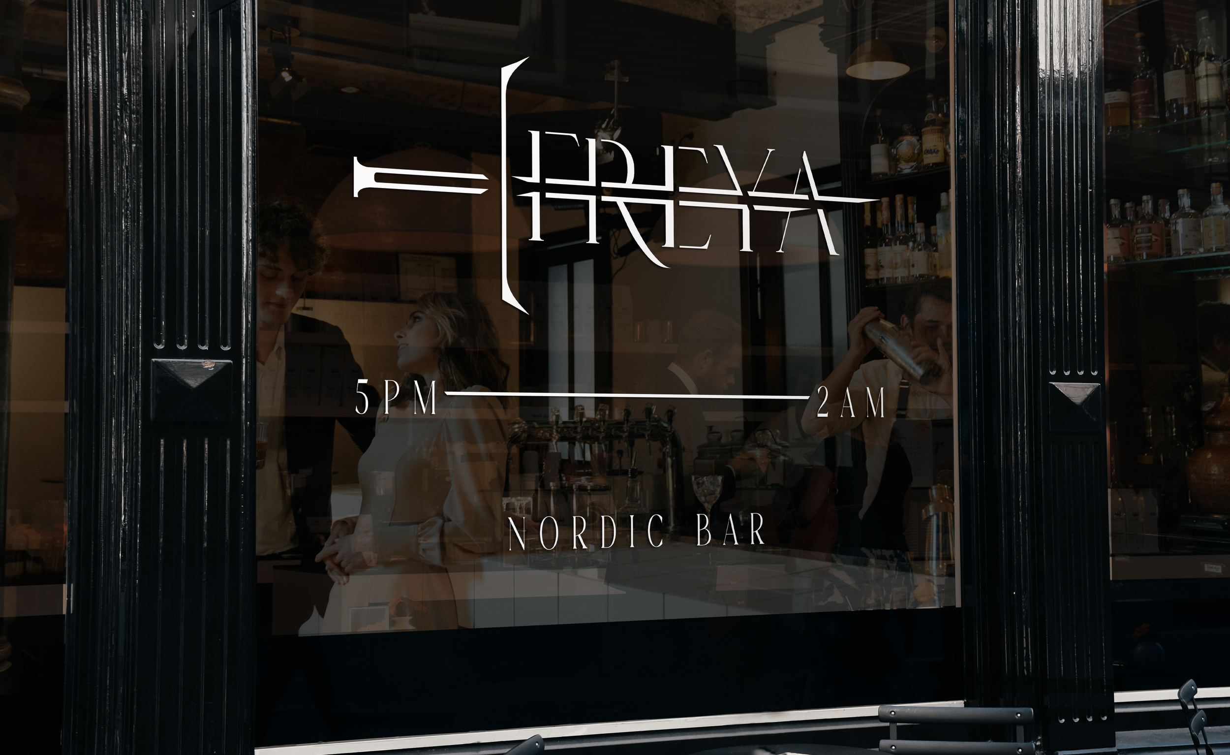
Freya is an elevated restaurant and bar experience that offers a taste of Norway's unique cuisine in the form of modern appetizers and handcrafted drinks. The restaurant aims to provide an overall exclusive experience that introduces its guests to the traditional foods of Norway.
Bold imagery, refined typography and a clean minimal aesthetic allow Freya to stand out and gives the brand an upscale feel.
DELIVERABLES
Brand Identity
Website Prototype
Motion Media
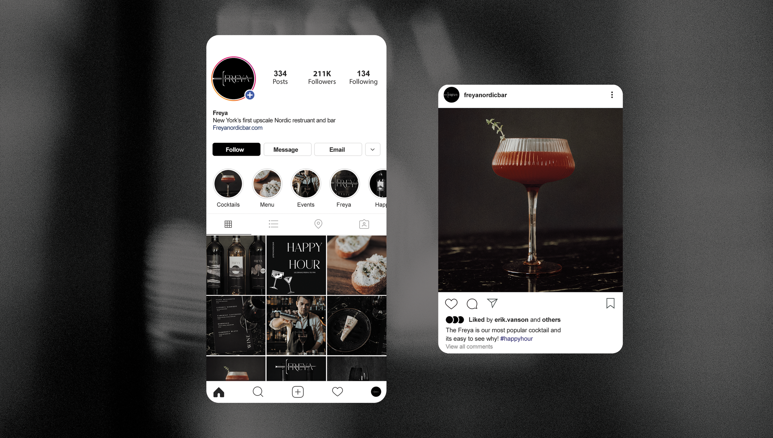
Social Media
Packaging
Apparel
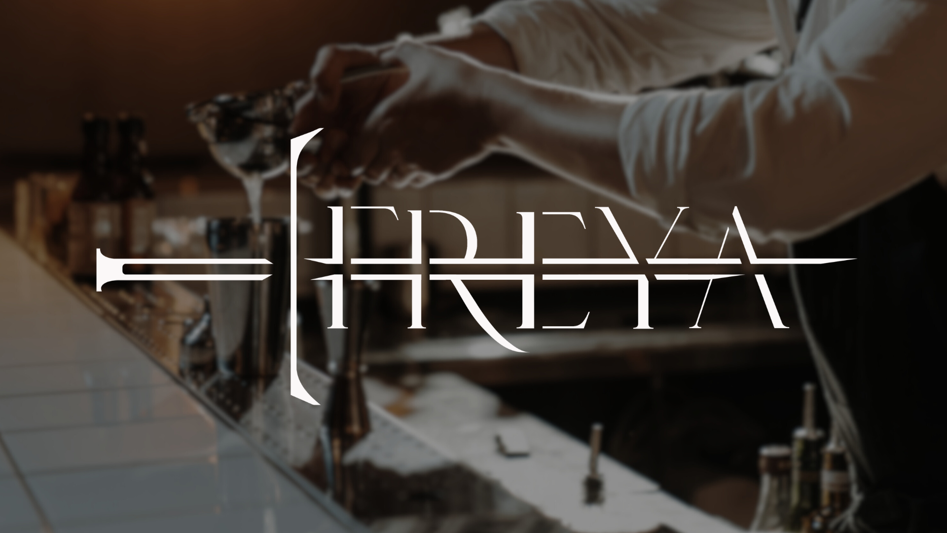
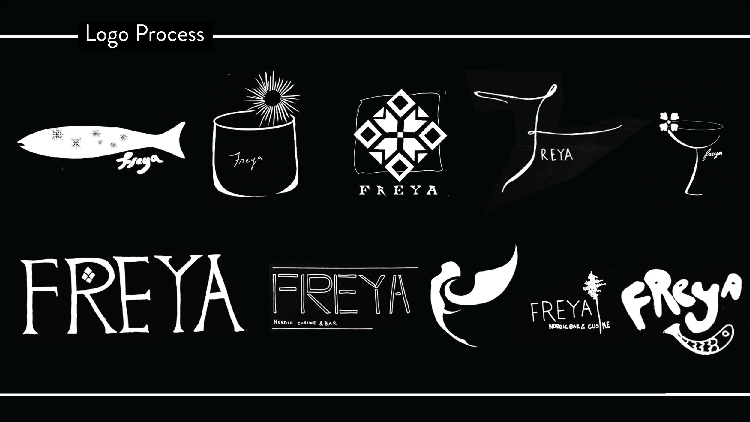
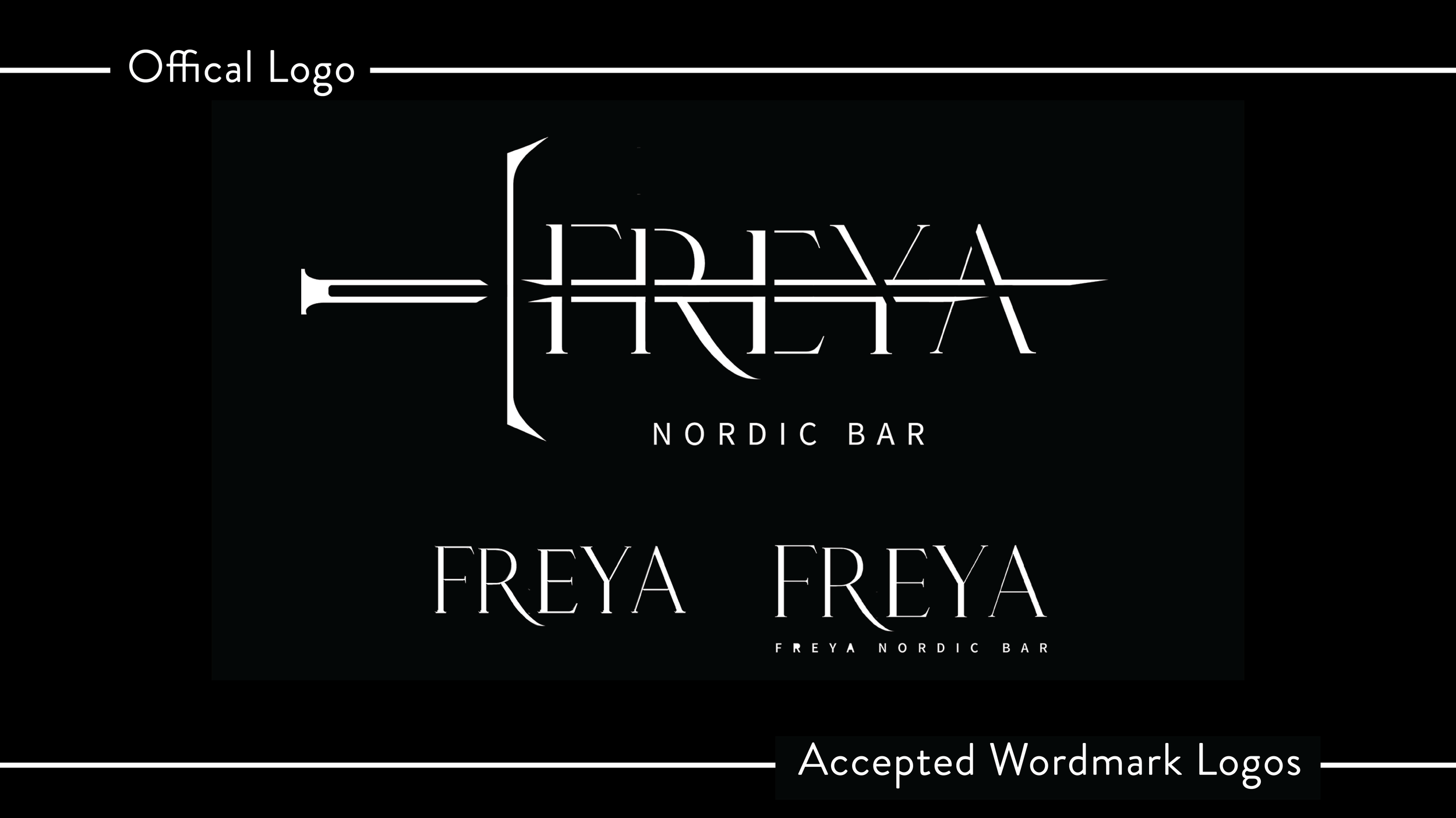
The word Freya means lady in old Norse. The name was inspired by the name of one of the most prominent goddesses in Norse mythology, Freya or Freyja, the goddess of love, beauty, fertility, magic, war and death.
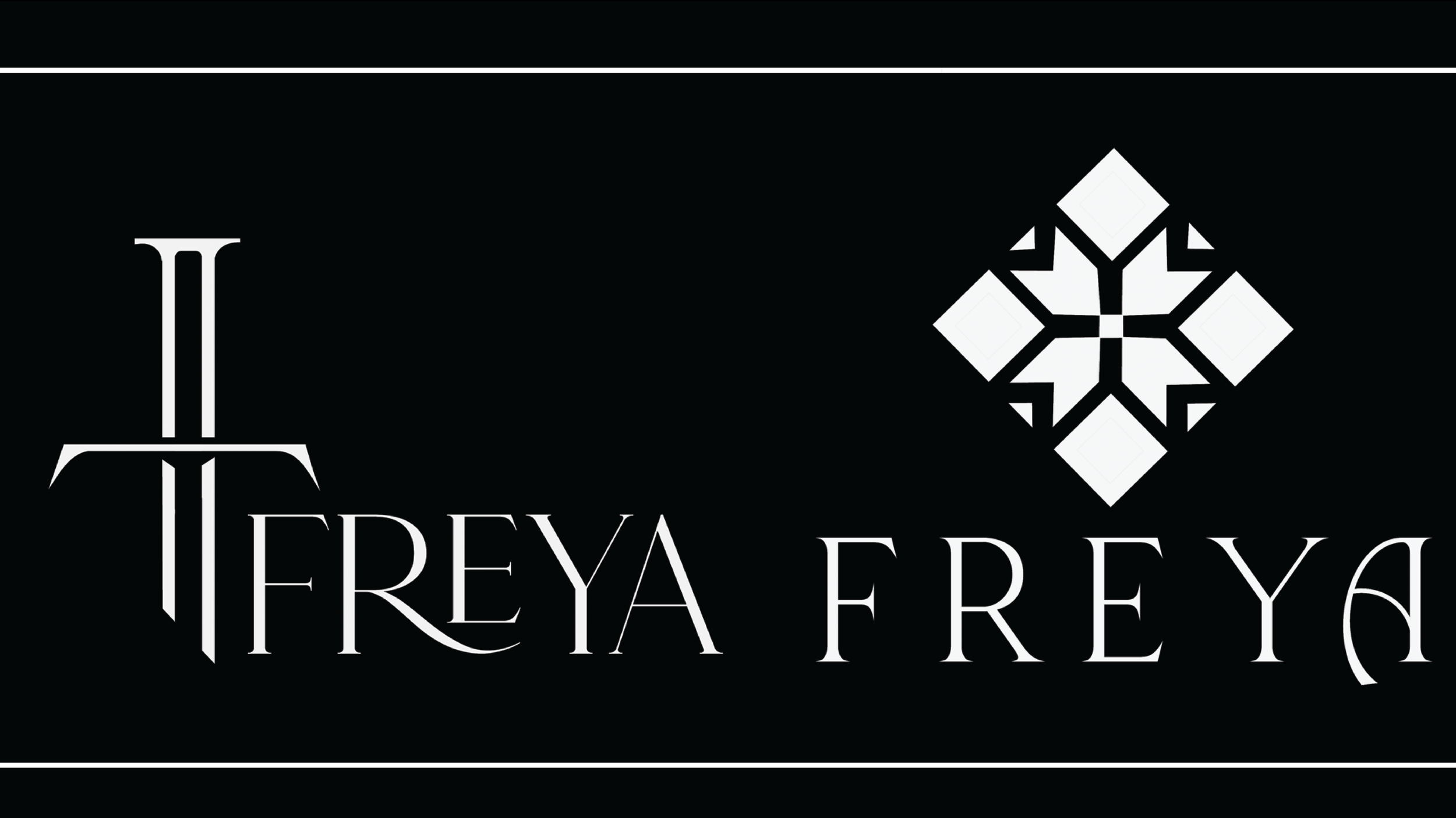
The logo takes inspiration from the sword that is carried by the goddess Freya in Norse Mythology named Thrungva.
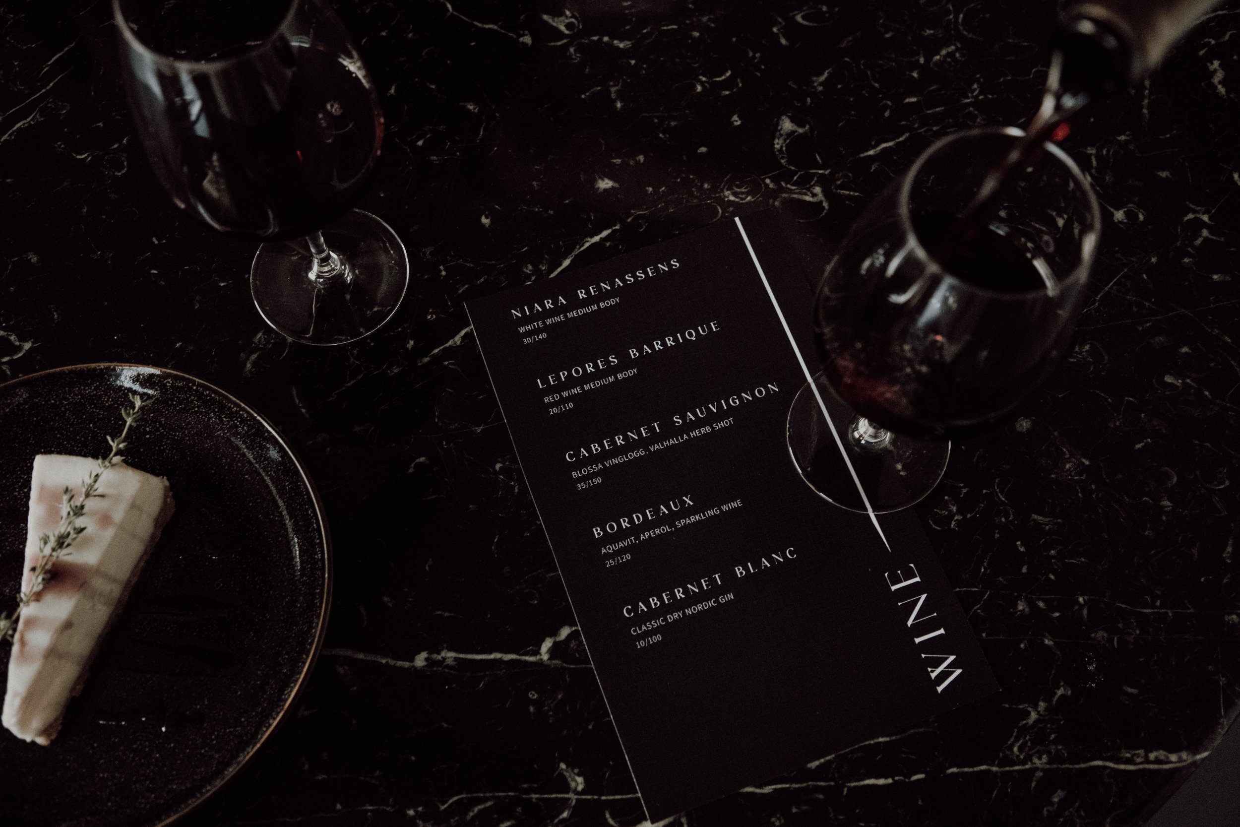
TYPE CHOICES


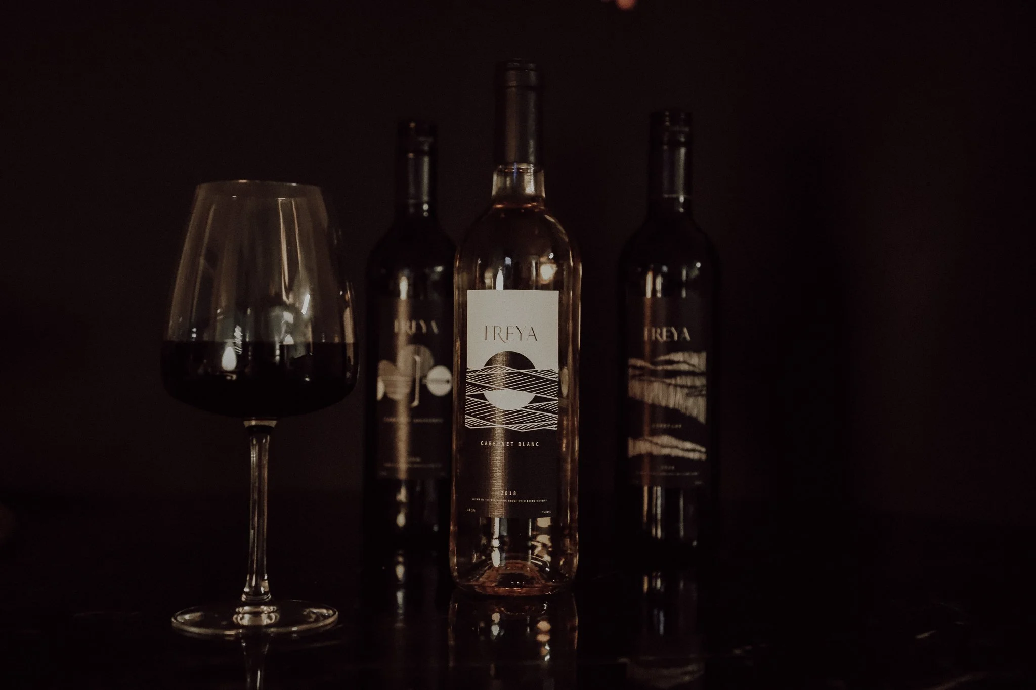
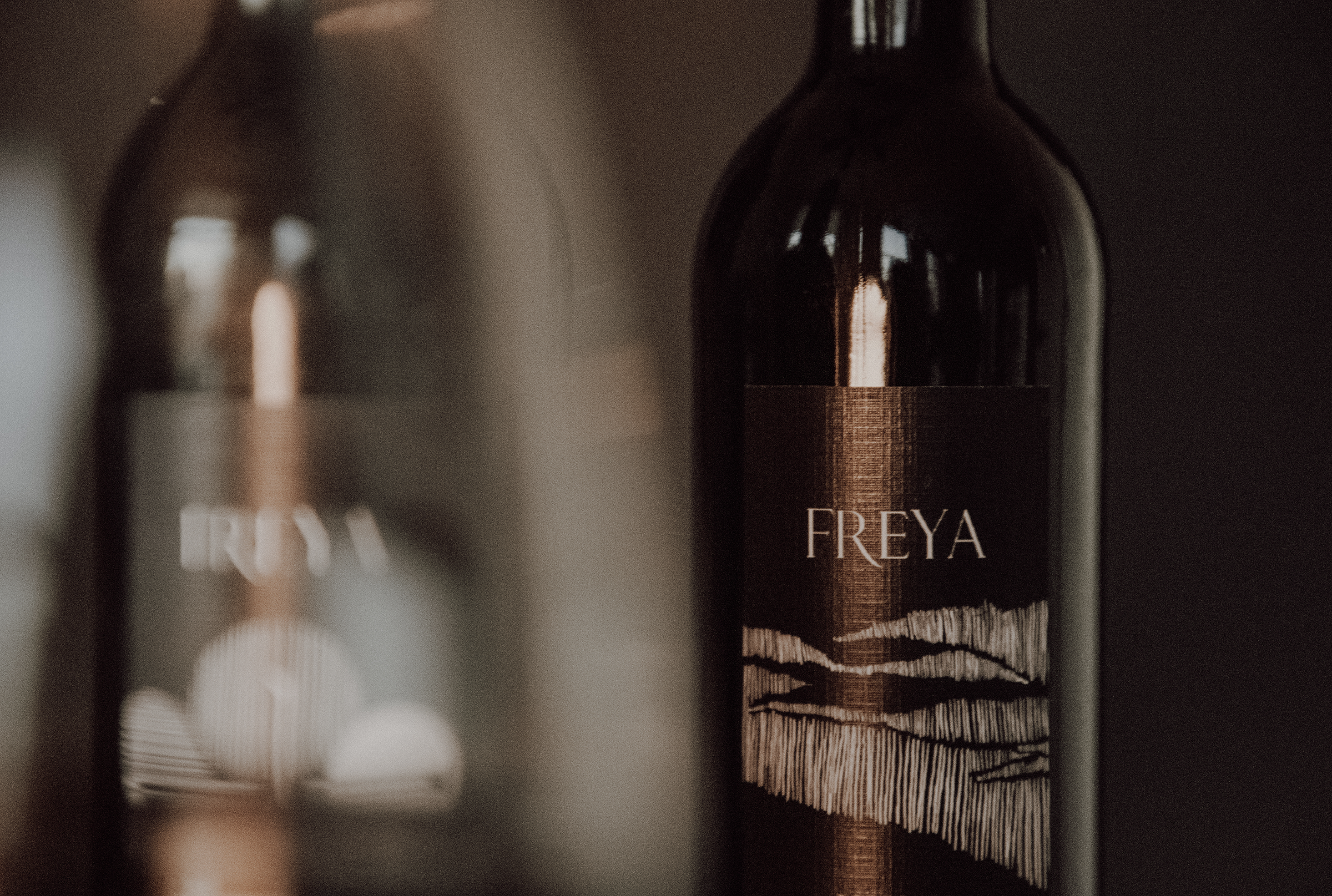
Inspired by the diverse natural landscapes in Norway the design for the labels of the three house made wines focuses on the use of line and color blocking to showcase some of Norway’s best natural phenomenons such as the midnight sun, the fjords and vast mountainous region.
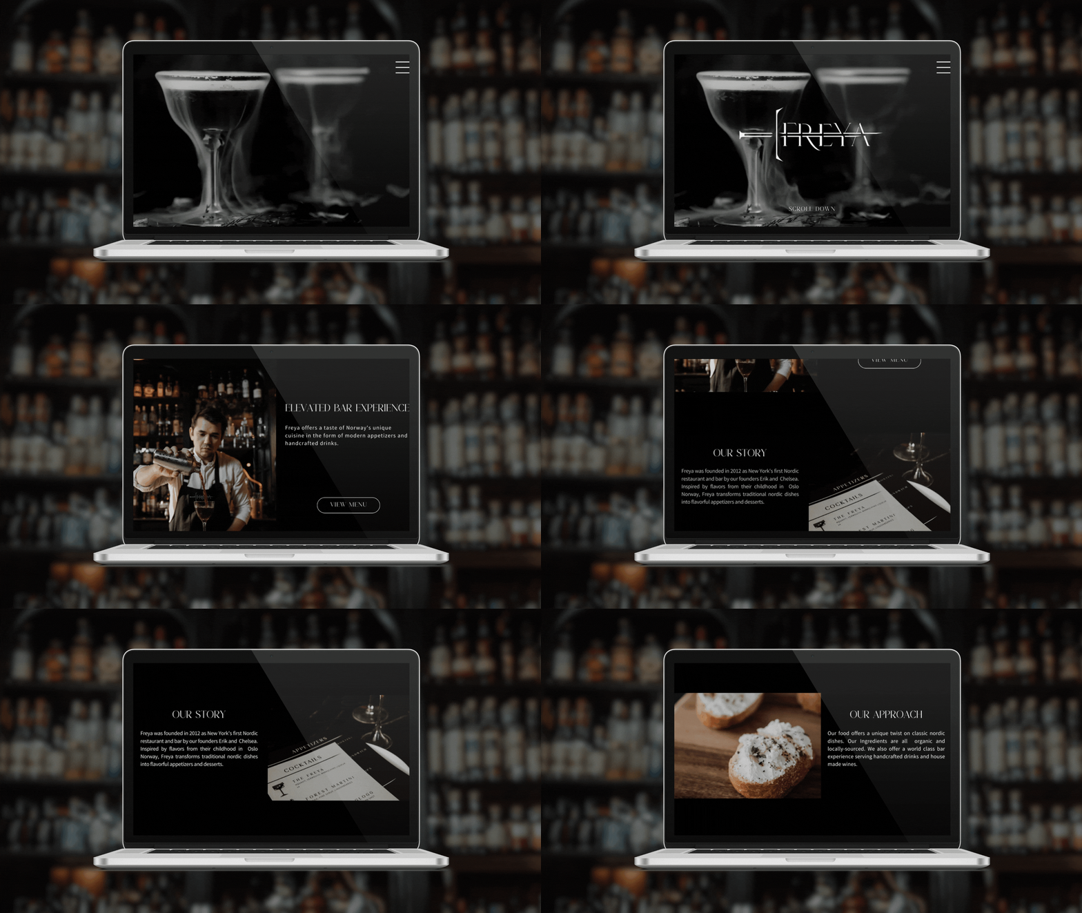
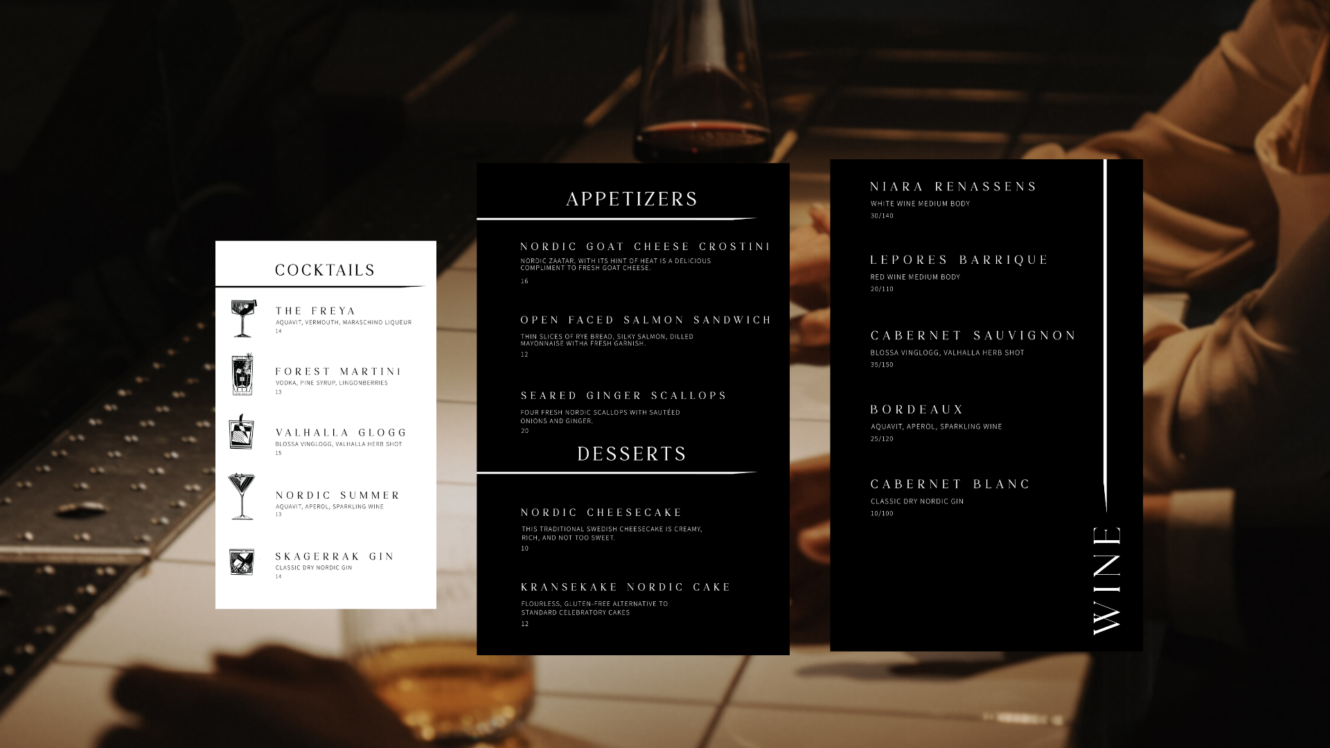
The website aims to show potential customers the atmosphere of the bar and give them a place to view the menu, and the company’s approach.
